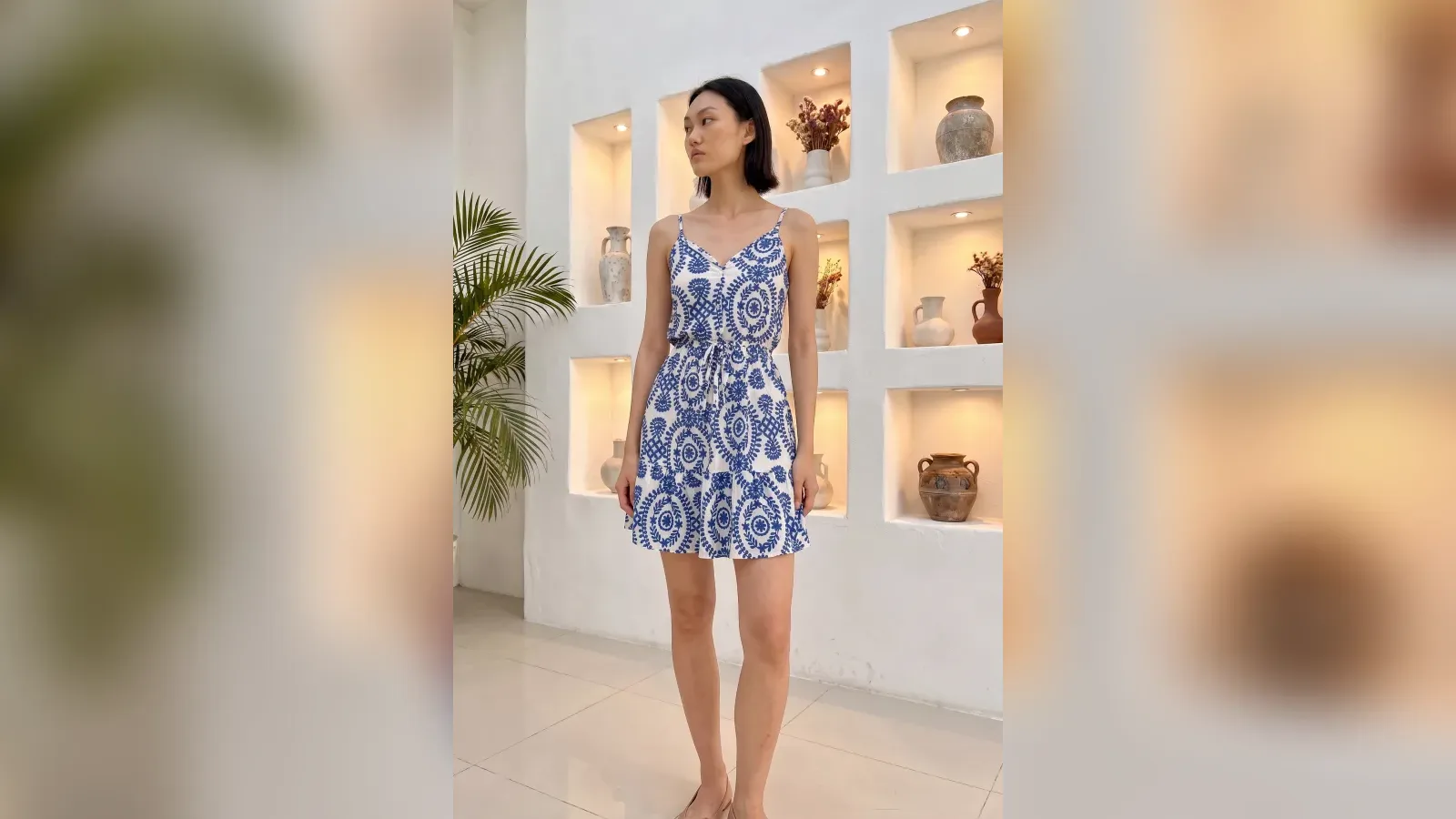
The same dress reads as "a product" on a white backdrop, "a style" in an elegant living room, and "a life" on a sunset street. The product did not change; the scene did. Scene selection is not decoration, it is purchase psychology: the moment customers can see the product inside their own life, the decision moves closer.
This guide covers the four basic scene types, which product groups each one suits, and the rules that must survive every choice.
The four basic scene types
1. White or plain backdrop: the standard of catalogs and marketplaces. It shows the product most clearly and makes comparison easiest; it carries little emotion, but its job is information, not emotion. Every product needs at least one plain-backdrop frame.
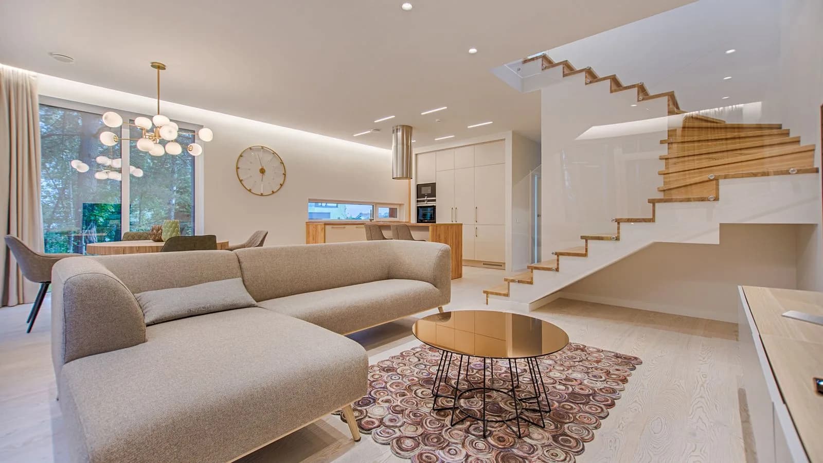
2. Interior (lifestyle): homes, cafes, offices. The natural scene for daily wear, knitwear and relaxed pieces; it tells the customer "this belongs in your everyday". Keep light soft and decor sparse: the space should tell a story without competing with the product.
3. Street and outdoor: energy and season. A trench coat means something on an autumn street; a linen shirt belongs in summer light. The risks are uncontrolled light and busy backgrounds; plain walls, clean pavements and morning hours are the safe start.
4. Editorial/studio mood: colored backdrops, dramatic light, artistic composition. This is the territory of evening wear and brand imagery. Powerful, but overdone it eclipses the product; it should carry the collection's highlights, not its entirety.
Quick matches by category
- Daily wear: interiors and streets. Familiarity sells.
- Evening and occasion wear: dim, elegant editorial settings. Shine needs a quiet stage.
- Modest fashion: calm interiors and graceful outdoor scenes; details in the modest fashion photography guide.
- Activewear: movement and outdoors; the energy comes from the scene.
- Kidswear: bright, warm, playful spaces; sterility reads cold.
Color harmony: the scene must not kill the product
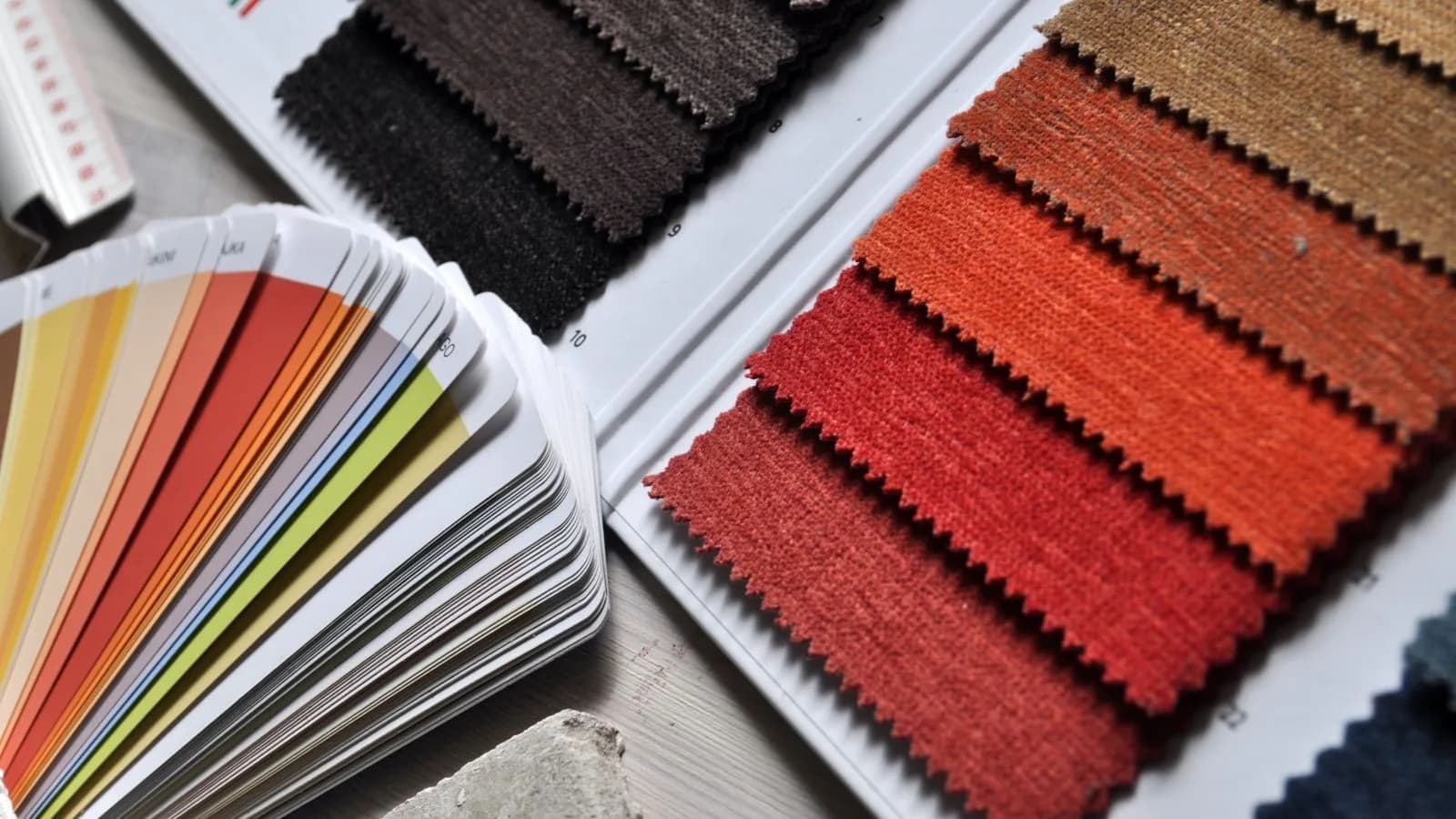
Two classic failures. Competition: a bright, patterned, busy scene steals the eye. Disappearance: tone-on-tone setups, like a beige product on a beige wall, reduce the product to a silhouette. The safe rule is simple: keep the scene one step paler and one step plainer than the product. Patterned product, plain background; plain product, lightly textured background at most.
The rule that never bends: one language per collection
The most expensive scene mistake is building a different world for every product. A storefront that shoots five products in five aesthetics looks like a bazaar stall, not a brand. Fix a palette of two or three scenes at the start of the season and shoot the whole collection inside it. This is the heart of branding, continued in a consistent visual language.
Marketplace and your own site are different jobs
Marketplaces demand plain, light main images; atmospheric frames live there only as secondary images. On your own site, the storefront frame takes the lead. Plan two sets per product from day one: plain for marketplaces, scenic for your channels. Collections shot without this split usually get shot twice.
The fastest way to build a scene
Finding, renting and lighting real locations is the expensive half of scene work. AI changed that math: with virtual model tools the scene comes from a ready library, and showing the same product on a plain backdrop, in a living room and on a street is three clicks, not three shoots. When trying a scene costs nothing, choosing the right one stops being guesswork: generate both, watch the conversion. A demo account is enough to test with your own product.
Three questions before you publish
- Does the scene match the product''s price perception? A premium piece cheapens in a messy room.
- Do the light direction and tone match the rest of the collection?
- Does your eye land on the product first, or the scene? If the scene, simplify it.
The right scene is the cheapest costume a product can wear. Set the rules, fix the palette, and let the volume flow.
Frequently Asked Questions
What background color is best for product photos?+
White or light gray is the standard for catalog and marketplace frames. For storefront frames the rule is balance, not color: keep the scene one step paler and plainer than the product, and keep backgrounds plain behind patterned products.
Should every product get its own scene?+
No. A fixed palette of two or three scenes across the collection builds a branded storefront; a different world per product creates inconsistency and erodes trust.
What scenes do marketplaces require?+
Marketplaces require plain, light main images with no text or watermarks; atmospheric scene frames are allowed only as secondary images.
Can I get different scenes without renting locations?+
Yes. AI tools select scenes from a ready library, so the same product can appear on a plain backdrop, in an interior and on a street within minutes; trying a scene effectively costs nothing.