An e-commerce visitor decides in seconds, and the decision is driven mostly by the image. The bad news: the image mistakes that cost sales rarely look like mistakes. The storefront seems "fine", yet conversion stays low and returns stay high. Here are the five we see most often, why they hurt, and how to fix each one.
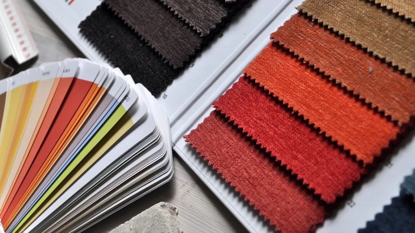
1. Color shift: one color on screen, another in the box
"The color was different" leads every return-reason list. The culprit is usually the shoot, not the product: wrong white balance, warm home lighting or heavy filters turn cream into yellow and burgundy into red. The customer trusts what they see, orders, opens the box, and the trust leaves with the return shipment.
Fix: Lock the white balance on every shoot, photograph in daylight or neutral white light, and leave color untouched in editing. When in doubt, hold the product next to the screen; if they differ, the image is not ready to publish.
2. An inconsistent catalog: every product from a different world
White background here, a living room there, a street shot next; some frames close, some far. Each image is "okay" alone, but side by side on the collection page they read as a flea market, not a brand. Inconsistency tells the customer one thing: this store is improvised.
Fix: Decide once, apply always: same background, light, framing ratio and layout. This is the heart of branding, so we gave it its own guide: a consistent visual language.
3. Unclear fit and scale: "how does it look on me?"
A garment sold with only flat-lay or hanger shots leaves the customer's most important question unanswered: how does this sit on a body? The unanswered question either blocks the purchase or books the return in advance. "It looked baggier" and "it was shorter" are failures of the image, not the product.
Fix: Add at least one on-model image per product; state the model's height and worn size; put the size table next to the gallery. No model budget? An AI virtual model closes the gap for a few credits; we compared all the options in the model-free photography guide.
4. Low resolution and the wrong format
A blurry, pixelated image communicates carelessness, and marketplaces reject low-resolution frames before listing anyway. The flip side matters too: oversized files slow the page, and a slow page loses both customers and Google ranking.
Fix: Export at 1600 to 2000 pixels on the long edge, in compressed webp. Serve fabric texture as a separate close-up frame instead of uploading a giant main image.
5. One-note imagery: catalog without a storefront
If the whole page is white-background packshots, the product looks like a file photo: no emotion, no outfit, no life. The reverse is also a mistake: all mood, no clean catalog frame, and the customer cannot inspect the product.
Fix: The pair rule: every product gets one clean catalog frame plus at least one scene or on-model frame. Scene choices are covered in choosing the right scene; for budgets, see the pricing guide.
Bonus: two small but expensive habits
Text and watermarks on images: marketplaces reject them on main images, and they look cheap on your own site; campaign copy belongs on the page, not the pixel. Missing detail frames: without a fabric close-up, "is the fabric thin?" stays unanswered, and unanswered questions become returns.
The five-minute checklist
- Does the product color match on screen and in hand?
- Does the collection page look like one shoot?
- Does every product have an on-model image and size info?
- Are images webp, sharp and fast to load?
- Is the catalog-plus-storefront pair complete?
Five yeses mean your imagery is not losing you sales. Anything less is good news in disguise: none of these fixes needs a big budget, just order, care and the right tool.
Frequently Asked Questions
What is the most common product image mistake?+
Color shift: wrong white balance and filters change the product color, and 'the color was different' returns follow. Locking white balance and shooting in neutral light solves most of it.
Do product images really affect return rates?+
Directly. Color, fit and length expectations are set by the image; if the image sets the wrong expectation, even a correct product comes back. On-model images, size tables and fabric close-ups reduce returns up front.
How many images does each product need?+
A practical floor: one clean catalog frame, one on-model or scene frame, one fabric or detail close-up, and a back view where relevant. Four frames answer most of the questions customers ask.
What format and size should product images be?+
1600 to 2000 pixels on the long edge, compressed webp. That satisfies marketplace quality rules and keeps the page fast; speed is part of both customer experience and Google ranking.